Developers Revolt Against New VS Code Icons
I knew this was going to happen.
Developers are revolting against the new icons introduced by Microsoft for Visual Studio Code, the open source, cross-platform little cousin to the Visual Studio IDE.
Besides venting their frustration on forums and GitHub issues, the coding community has launched petitions to revert back to the original scheme, and developers have figured out on their own how to do a manual replacement.
I just knew this was going to happen.
When announcing the news in August, I started out saying Microsoft was "risking the wrath of recalcitrant developers." You just don't mess with the UI of an editor/IDE when it comes to typography, colors or other subjective aspects of design without annoying some segment of finicky coders.
Microsoft's effort to redesign several dev tooling icons came to light in a GitHub issue filed to request a new VS Code icon for Mac OS X in May 2016. Out of that discussion, new VS Code icons were revealed to be in the works, with some prototypes shown, and all angst broke loose. The issue now has 111 comments, still coming in this morning. Few of them are positive.
So, of course, another issue sprang up earlier this month, this one titled "New VS Code icon is ugly!" It says: "Can we return previous app icon or draw a new one? It really looks bad." Nine days old, the issue has garnered 153 comments.
Soon following that, developer Alex Kras last week posted a tutorial on "Restoring Original Visual Studio Code Icon on MacOS," inspired by one of the replacement icons offered up by GitHub commentators.
Here's a visual history of the issue starting out with the original icon:

The Previous VS Code Icon (source: Microsoft).
Then, during a lengthy development process, these icons were proffered in an August post by Microsoft, with different variations for stable and Windows Insider releases on different platforms:
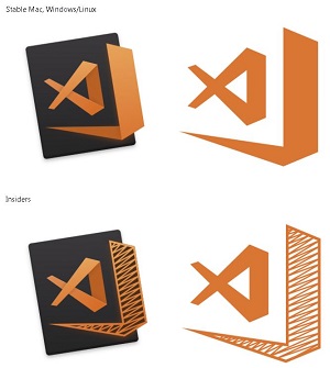
[Click on image for larger view.] The New VS Code Icons as Originally Presented in a GitHub Issue (source: Microsoft).
At the time, a Microsoft's Chris Dias pointed to a blog post titled "Iterations on infinity" blog post that he said does a good job explaining how the company decided upon the latest Visual Studio family of icons.
"For VS Code specifically, we took our time to iterate on a number of 'editor' related symbols before pivoting to a subset of the infinity symbol," he said. "We feel that the icon denotes 'openness'. It conveys that VS Code is (in a good way) a subset of our big brother, the Visual Studio IDE. And, if you look hard enough, you'll find a small tribute to a great mind."
And finally, this is what Microsoft introduced with VS Code 1.17:
 [Click on image for larger view.] New Logos Introduced with v1.17 (source: Microsoft).
Note that if you want to do a manual revert, the post by Kras provides instructions for doing so only on Mac OS. It simply involves downloading the original .icns files and copying over the new ones and forcing a refresh.
And similar workarounds -- which some developers said are easy to do -- will probably soon be available for Windows implementations, if they haven't already been published.
Because developers will never, ever, agree on design.
Where Dias saw "openness," another developer commenting on his post saw "too much going on."
Where Microsoft says the icon offers a new interpretation of the infinity sign, showing oppenness (with the open end), another developer asks why it was turned into a fish.
Where Microsoft's design exec John Lea says "I'm quite proud of what our designers have accomplished," a Hacker News reader thought the new icon "makes you think for a sec if the app is corrupted or something."
On Reddit, a reader said UX folks seem prone to being "artsy-fartsy, twaddlepated dweebledorfs."
Other readers of Dias's post weighed in with comments such as:
- "Why orange? Why not blue as same? I think blue is look better than orange."
- "The old green Icon was much more minimalistic, is there somewhere I can get it to swap it out manually? This new one doesn't stand out and just blends in with the rest making it harder to see."
- "It's also really difficult to tell the two icons apart at small sizes, especially on MacOS. I like the concept, and I think the two icons look fantastic, but I don't think they are an improvement."
Comments on our August article included:
- "I don't like this new icon at all .. look stupid and not nice colors .. why mimic sublime text icon actually .. I want the blue icon back"
- "We feel that the icon denotes incompetence from Microsoft, taking 4 months to design an icon that is simple, ugly and with only one color that any children could realize in less than an hour."
- "OMG I hate this icon. Everything was so clean before. I had VS Code, Express and Studio all lined up in pretty order. Messing up my feng shui man!"
- "lol I am happy that the old icon was changed. Because I often accidentally opened Microsoft Outlook instead of Visual Code. Now this no longer will be the case."
Besides the commentary, other GitHub users have filed issues saying "VS Code icon is too transparent" and "new VS Code icon doesn't look right in Windows Open dialog" and "New icon too similar to sublime."
BTW, that last comment was duplicated by a Visual Studio Magazine reader ("Now I open Sublime Text 3 every time I want to open VS Code") in the commentary on our August article. That article, as I write this, is the most popular one on the site, surpassing recent top-notch, hands-on tutorials from subject-area experts on topics such as writing precompiled Azure Functions, building DOM additions with Angular and TypeScript, neural network L2 regularization using Python and so on.
Which, of course, is why I'm writing this.
Because my feelings are more aligned with the top comment on Hacker News, which says, in part: "Really? It's an icon. An icon! And we are spending time deliberating on this? Stop being petty and worry about things that actually matter."
So tell me why it matters. Because it obviously does. How does the color/shape of a tiny icon affect your performance when using VS Code? Comment here or drop me a line.
Posted by David Ramel on 10/16/2017